By Virginia Hughes
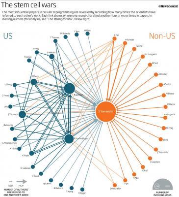
Last year, 14 stem cell biologists from outside the US complained to journal editors that their papers were being sabotaged in the peer review process, resulting in delays or rejections. A provocative claim — but was it true?
Peter Aldhous, San Francisco Bureau Chief of New Scientist, got to the bottom of the story: Yes, in top journals, stem cell papers submitted by American researchers are published faster than are papers submitted by non-US researchers. What's more, one researcher — Shinya Yamanaka — gets cited far more often than anybody else. Aldhous discovered all this thanks to data visualization.If I learned one thing at this afternoon's data visualization session, it's this: working with data can not only help journalists tell great stories, but find great stories.
Aldhous and his fellow panelists — Eric Hand, a reporter at Nature, and David Harris, editor of symmetry — showed dozens of examples of the ways in which they have incorporated data sets (large and small) into their stories. Eric once used census data to map all of the outhouses in Arkansas. David helped his wife, a criminologist, track life events of prisoners.
Luckily, spotting interesting patterns in data is easier than you might think. The panelists mentioned several free and easy-to-use online tools for making infographics. Here are a few of my favorites:
-
Tableau Public: Allows you to publish interactive data to the web — for free, and no programming skills required!
-
Google Docs Motion Chart: Simple bubble-chart maker that allows you to look at data over time
-
geocommons: Create and share interactive geographic data and maps
Of course, putting together a clear and compelling infographic takes skill. I'll leave you with three tips from Eric:
-
Sometimes the best chart is no chart. If you can say it in words, say it.
-
Keep it simple (and in the service of the story). That is -- avoid infoporn. (Case in point.)
-
Be fair. You can manipulate people with data just as easily as you can manipulate them with words.


