By Kerry Klein
Liz Neeley draws inspiration from an atypical source: the comedian Jon Stewart. In particular, the artist and Story Collider executive director enjoys reliving a moment in 2006 when Stewart appeared on the television show Crossfire. “Here’s just what I wanted to tell you guys,” Stewart told hosts Tucker Carlson and Paul Begala. “You need to stop hurting America.”
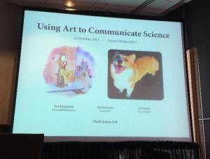
Neeley played this excerpt to the audience of the session entitled “Using Art to Communicate Science,” only she wasn’t referring to television punditry — she was warning against bad story art. And she was only half joking. She wanted science communicators to know that careless visuals can undermine their message and hurt their story.The session, which also featured prolific science illustrator Hal Mayforth and was organized by Yael Fitzpatrick, manager of design and branding at the American Geophysical Union, endeavored to demystify the process of creating engaging visuals. The trio came together to offer a roadmap toward crafting art that enhances and deepens a story’s message.
Fitzpatrick, who formerly directed the art department at Science, opened the session by pointing out that the same principles that apply to writing a story can guide its visuals. The first question any writer should ask is: what’s the message? Then, find an image that expresses it clearly and succinctly. Simple is better; less is more. No clutter, no snapshots, and certainly no collages. But analogies are good. As an example, she referred to a 2010 Science cover about a complex physics concept known as the Lamb shift. It was far too complicated to explain visually, so she instead chose an analogy: a wine bottle reflected to infinity between two mirrors. It didn’t fully explain the Lamb shift, but it didn’t need to. The overall goal of art, Fitzpatrick said, is “making people say ‘ooh.’”
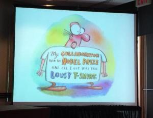
Mayforth, who penned an iconic cartoon of a grad student holding a sign reading, “will explain Higgs boson particle for food,” suggested hiring an illustrator whenever feasible. “There’s a certain dumbing down of things,” he said, “if you don’t get a professional to help you out.” But that process doesn’t need to be stressful. Just as an editor and writer discuss story direction, pairing art with text is simply a conversation. It’s best to begin that conversation at the beginning of story production and allow the two to evolve together.
Should writers want to create their own art, said Neeley, they have more than smartphone cameras and Clipart at their disposal. Google and Flickr offer creative commons image search options, sites like Colorbrewer2.com help provide color schemes, and the free program Gimp offers many of the advanced image editing tools included in the more expensive Adobe Photoshop. If you’re crunched for time and have only two hours to plan your art, Neeley suggested dedicating only 30 minutes to planning, the rest to designing and executing. Otherwise, she warned, “you can waste all your time looking for the one thing you want.”Neeley reiterated that bad art is worse than no art, and finished the talk with a modified quote from Arthur Ashe. “Start where you are, use what you have, do what you can,” she said. “And please stop hurting America.”
